Blog

Interop 2024 Is Here! CSS Nesting, text-wrap: balance, Relative Colors, And More!
Last updated:
Interop is a movement to standardize the features supported by web browsers, so that web developers can use features comfortably, knowing that all browsers will be able to display their content correctly.
This year's Interop is a bit controversial. JPEG XL has been nominated and it has more than 4 times the votes compared to the second most voted nominee, and yet it was not accepted into the final results. Some say that Interop has never been about adopting revolutionary changes and is more focused on standardizing features that already exist on one browser (which is funny, since Safari already supports JPEG XL just fine), while some say that this is yet another case where Google is using their power and influence to control the web standards. Either way, this is sad, but we can see that industry adoption of JPEG XL has only ever continued, with Adobe Lightroom already supporting JPEG XL (with rumors that it will also be supported in Photoshop soon), and we're seeing changes in the Windows codec APIs that suggest JPEG XL is also coming to Windows 11 or later. Almost all open-source software and Linux desktops already fully support JPEG XL. In fact, the GNOME desktop already switched their default background images to JPEG XL.
Regardless of the case, Interop 2024 has announced that they will focus on new features that seem to be actually useful. This will give web developers more ease when developing websites, and designers more freedom in achieving the result that they want. Let's check some of the features!
CSS Nesting
This has been a very requested feature, and CSS preprocessors like SCSS and our favorite, PostCSS already has support for nesting. But with this, nesting will come enabled by default natively!
CSS Nesting lets you nest your CSS selectors, transforming something like this:
.selector1 .selector2 {
  color: white;
}
.selector1 .selector2:hover {
  color: black;
}
.selector1 h2 {
  font-size: 2rem;
}
into:
.selector1 {
    .selector2 {
        color: white;

        &:hover {
            color: black;
        }
    }

    h2 {
        font-size: 2rem;
    }
}
This makes CSS easier to understand, and is more concise. HTML is nesting so there's no reason why CSS shouldn't be nested as well.
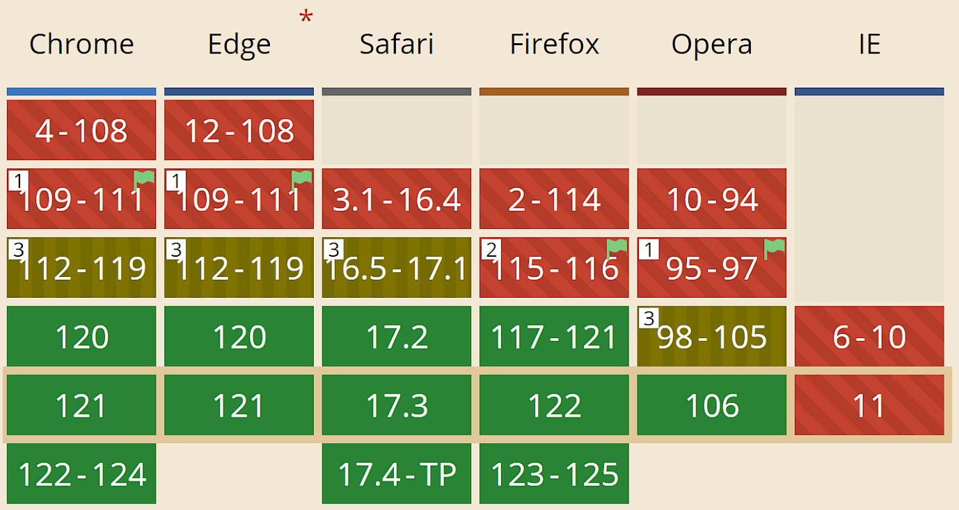
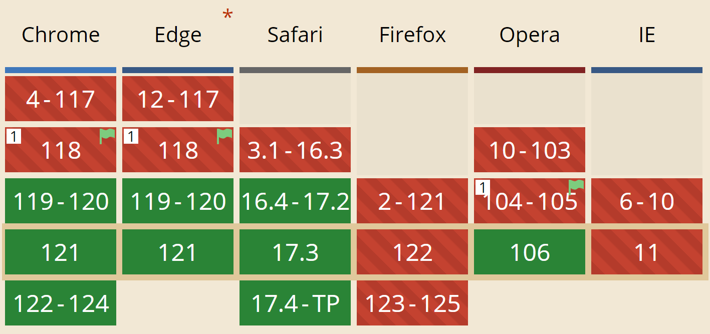
CSS Nesting now has 83% support coverage and thanks to Interop, this will only improve as time goes.
text-wrap: balance
When you want the text to be perfectly distributed in each line, you would probably add <br> tags after each line you want to separate so you can adjust precisely where each line would end. However, this makes the position of the line break fixed, and would not adjust based on the width of the element.
Thankfully, text-wrap: balance will soon be usable. This CSS property will automatically distribute each line of text so that each line is almost the same width as the other lines.
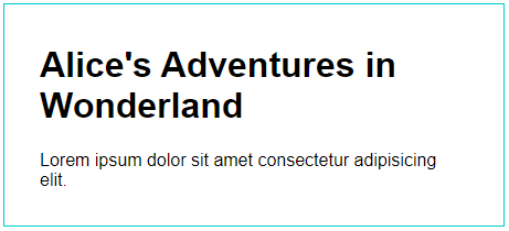
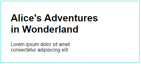
We can see that while the <div> is exactly the same width on both sides, text-wrap: balance ensures that when a line break occurs, all the lines get the same amount of text (at least, as close as possible) instead of just letting the break happen wherever it does.
As of writing, the support coverage is still at 68% so it's not quite ready to use yet but we'll get there.
Relative Colors
This is one of the cooler new features landing in CSS: now we can do various operations on colors to get another color!
Say we are designing a website and the brand color is #00CCCC (hey, that looks like this website!). Now we wanted to darken it. That's easy. That would probably be something like #008888. And you're right! But what if it was a more complex color, like #5EEAD4? That's a lot harder to compute mentally. Fortunately, using relative colors, we can derive another color from an existing color!
:root {
  --theme: #5EEAD4;
}

/* Convert that color to OKLAB and add 14% to its lightness while setting opacity to 0.5 */
h1 {
  color: oklab(from var(--theme) calc(l + 14) a b / 0.5);
}

/* Convert that color to OKLCH and make it monochrome */
h2 {
  color: oklch(from var(--theme) l 0 0);
}
You can probably already imagine the things that you can do with this! And if you're wondering about what OKLCH and OKLAB are, they are better color spaces you can use instead of plain sRGB. We're making a follow up article on them so stay tuned!
Browser support is okay-ish at 78% but Interop efforts should improve it as well.
Really Interesting Times for Web Dev
Looking back at the old days when people had to use HTML tables to have any semblance to a layout, and images for buttons shows just how far we've come. The fragmentation of web browsers is an annoying thing, but then, there are other dangers that monopoly in web browsers can cause, so this is an ongoing problem.
Thankfully, efforts like Interop 2024 helps to make the web a unified technology that not only developers, but also everyday users can enjoy.
If you're looking to make a website and need help, why not consider us? We use the latest technologies (within reason) to make sure that your website loads fast, adapts well to all screen sizes, and is faithful to your original design. After all, your website is the gateway to your business, your content, and your services, so let's put the effort into making it as best as possible. Contact us now, and we will do our best to help you!